
When I graduated I knew that I loved creating hand-crafted 3D illustrations. However, I didn't quite know how to make this illustration technique work in a professional context.
How could I give clients a good idea of what their finished image would look like? And how could I create detailed work within tight deadlines?
Over time I have worked out a method which works very well for me.
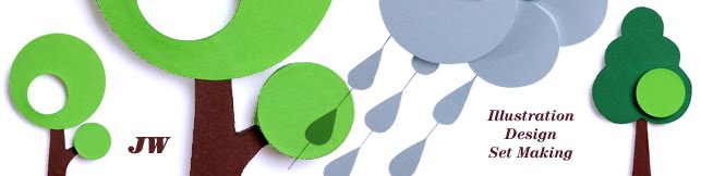
I would like to share it with you, using the illustration example above as example.
1. Get your pencil out
I suggest you start with rough pencil sketches. This helps to get you thinking and exploring possible concepts for your illustration.
My sketches are c. 5 x 8 cm, and they are no works of art! I don't show them to anybody (sorry guys). I just use them to get my ideas down on paper where I can develop them further.
This isn't the stage to be a perfectionist – just draw what comes into your head, and follow where your ideas lead. Keep sketching until you have a workable concept for your illustration. The finessing will come later.
Take a look at books, photos, websites, patterns, fabrics, or any inspirational collections of images or objects you may have. These can help to spark ideas or suggest fun objects you may like to include (or make).
Photo libraries are helpful if you decide to buy photos to include in your illustration – see for example istockphoto.
2. Start assembling your cast

Now you need to start assembling a few of the key objects and figures that will feature in your illustration.
Eventually you will need to find or make every object in your sketch. But at this early stage a few key objects will be sufficient. If you already have some real physical objects which you would like to include, then get them out now.
I have several boxes of vintage objects which I look through when I get a new project. I also regularly look in local shops and markets to see if there is anything which has the potential to be useful in future illustrations.
However, it's best not to rush out to buy a full set of new objects just yet. You may not end up using them all, as your ideas continue to develop. Also, multiple trips to the shops can be both time-consuming and expensive.
If you find an object that may work, take a few quick photos of it – if possible from different sides and camera angles. Imagine how you might want to use the object in your illustration. Your photos may give you ideas that lead you to rework your original pencil sketch.
3. Select the right colours

Unlike a drawing, a handmade 3D illustration basically "starts" with a colour layout. The previous steps were preparatory.
Let's assume you have an illustration concept that you like, and have identified some great objects which you would like to use, or make and then include. You now know enough about your illustration to make a colour selection.
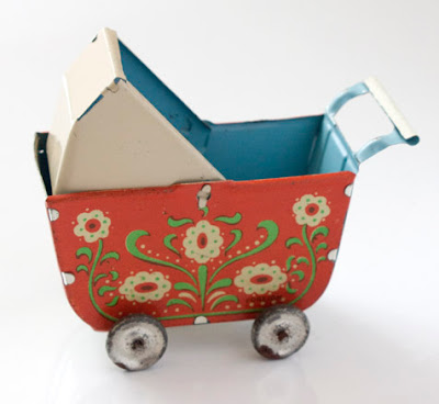
If you have decided to use a real physical object, or want to include a particular fabric or pattern, then it's a good idea to use their colours as a starting point for your colour scheme. This will ensure that your real physical objects will harmonise with the things you are planning to make. For some great inspirational colour schemes you could have a look at colourlovers.com.
For this illustration the colours of the antique pram were my starting point. I then looked through my large collection of coloured and patterned papers and tore out samples of other colours which would go with them. I often start by selecting a range of different examples of a particular colour which I would like to use (e.g. I have probably 7 different shades of green in my paper collection – including warm, cold, light and dark hues). I then narrow my selection down to one or two of those examples, and add these to my colour scheme. For each illustration, I normally choose between 4 and 6 different colours to work with.
4. Sell it!

Okay, so let's get serious and create a colour layout (or mock-up of the final image) which will sell your idea to your client. If your illustration will include photographs of real physical objects, or scans of photographs, then Photoshop will be the best program to create your colour layout in. Otherwise, just use any other image manipulation software that you feel confident with.
The aim is to create a colour layout which is as close as possible to the final 3D illustration, without spending too much time on it.
In order to do this, the size and colour of the objects, and the composition of the illustration, will need to be worked out in detail, so that your client gets a good idea of what they will get (and can make suggestions and amendments).
A positive side-effect of preparing a layout is also that, when you create each made object in your chosen software package, you will have to think about how you will construct it. Are you going to construct your object using e.g. flat paper which stands upright with the help of a stand behind it, or as a 3D paper object that stands up by itself?
Another advantage is that you will also be forced to think about how much detail you would like to put into each object. If it already takes you ages to create an ornate object on screen, then chances are that you will also need a long time to construct it. This gives you the opportunity to assess whether you will realistically have time to make all of your objects in time to meet your client's deadline.
Preparing the colour layout will also force you to decide what colour and size each object will need to be. This will save you valuable time when you construct them. It is frustrating to have to make an object twice because the original colour or size is wrong.
Above are the 2 layout variations which I sent to my client. The plain colour objects indicate things which I intended to make out of paper.
5. Make it!
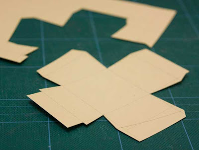
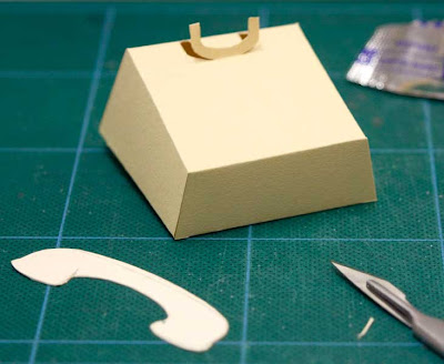

After all your hard work so far, now comes the fun part. Let's assume you have bought enough paper, and maybe even the lovely little (real physical) object which your client agrees will look just perfect in your illustration. It's now time to get your scalpel, tape and ruler out and start creating the remainder of your objects. In this illustration, my additional objects were made out of paper.
It's best to start by making the most important / biggest object for your image. I find that I'm often more relaxed at the beginning of the construction phase. There is plenty of time before the deadline, and it is easy to spend more time on my first object, making it more elaborate. It's logical that you should spend the most time working on the most crucial part of your image. If time gets tight towards the end of the process, and you need to simplify things, then at least you can be reassured that you invested your time in the right area.
The major object will also influence the size of all other things in your image. If you work with real physical items, make sure the size of each object is in proportion to the others, and as indicated in your colour layout.
While swinging the circle cutter, it's also a good idea to have a little think about the lighting you would like to use when photographing your image.
When I made the merry-go-round I left the roof rest loosely on its support so that I could – if necessary – re-position it during the photoshoot.
6. Get it sharp!

The next step is to arrange your objects in front of an appropriate background and photograph them to produce the final illustration.
Depending on the job you may want to collaborate with a photographer specialising in still life work.
If the timeframe (or budget) is tighter, and you feel sufficiently confident with a camera, it may be best to take the photographs yourself.
I invested in an SLR camera with a good lens and a Bowen flashlight set. These work really well for me.
Let's say you set a small aperture (e.g. f/22), ensuring you have a great depth of field, and the white balance is correctly set on your camera. Then make sure that your photo is neither under- nor over-exposed, and that the most important part of the illustration is sharp and in focus.
Once you have a photograph that you are happy with, send a low res version of your image to your client. While you wait for their feedback, make sure NOT to change the lighting, camera position or anything on the set – just in case some changes are needed (the client's feedback may be e.g. "Lovely, but could we see a bit more of the blue object on the right-hand side?").
And of course check on your computer screen that your photo looks as perfect as the little screen on the back of the camera promises.
7. Touch up and go!

Once your client has approved the low res image the touching up begins. Again, depending on the project, you may want to get an expert on board to do this for you. Otherwise, roll up your sleeves and get going.
A well-calibrated screen and good touch-up skills will help you to enhance your photograph, making sure that your 3D illustration is sharp and shiny.
It's always worth asking your client if there are any specific print profiles you should use and if they prefer the image in RGB rather than CMYK.
I hope this helps to get you going. Enjoy the process, and watch out for paper cuts.

